Websites are like magazines for your brand. They provide users with information, they direct inquiries that users may have and that is the first place they go, to know more about your brand. It’s safe to say that it’s important to make sure you make the best use of it! One of our favourite blogs, Finalsite, taught us to pay attention to 5 key things that will let us make the most out of our website.
1. Make Sure Your Homepage Answers the Five Most Important Questions!
Your website should have the right mix of style and functionality. In short, your websites look great while providing an easy-to-use and navigate experience.
However, looking great isn’t the only thing your website should do. Visitors likely first interact with your website through a search engine result, around 83 percent of visitors to be exact. This means most people that access your school’s homepage are coming in completely blind. Use your homepage to not only create the best first impression, but also answer the five most important questions a new visitor is likely to ask.
- What does your school offer?
- What makes your school unique?
- How can I learn more about your school?
- Where can I find your school?
- Will I (or my child) fit in at your school?
You can answer these broad questions in a variety of ways. Feel free to get as creative as you’d like while sticking close to your theme of choice. Let’s take a look at how Heritage Christian School in Indianapolis, Indiana uses the Avon theme, which features a standard navigation and utility navigation, to answer these five questions.
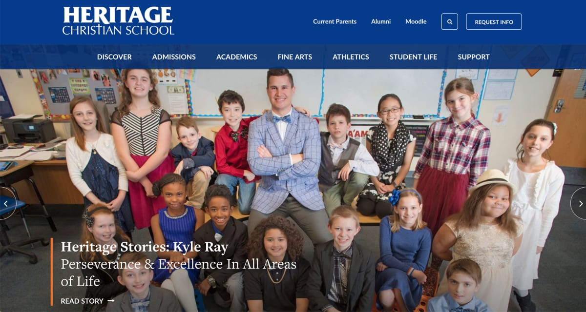


Heritage Christian School uses navigation best practices to simplify the user experience for current and prospective families. Plus, the “Request Info” call-to-action (CTA) button in the top-right is great for acquiring new prospect leads — a simple and effective way to answer questions #1 and #3.
The school then directly answers questions #2 and #4 through the elements at the bottom of the page that links to pages explaining how Heritage’s teachers provide a unique experience, and how the school maintains a 98 percent graduation rate, highest in Indiana.



Lastly, the school answers question #5 with the theme’s footer which contains all the contact information a prospective parent or student needs to know, including a “Contact Us” link to the “Location & Contact Info” page, and social media icon links on the right side of the footer.


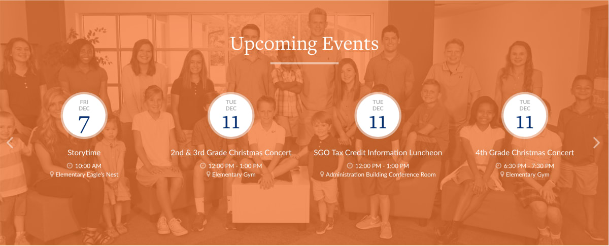
Heritage Christian School also makes excellent use of the Avon theme to keep its community and new visitors up-to-date with a Calendar element towards the bottom of the page, complete with a custom image background for added flair.


Similar to Heritage Christian School, Gwynedd-Mercy Academy Elementary in Spring House, Pennsylvania created a homepage with a different theme, East Hartford.
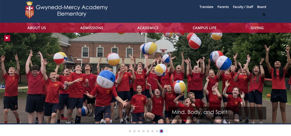


Their website also incorporates the same navigation best practices to efficiently guide visitors through the website. Questions #1 and #2 are answered in a way that visually demonstrates how the School uniquely shapes tomorrow’s leaders through an innovative, experiential, and 21st century education, with links to each.


Of course, the website also includes an “About Us” link at the top of the page for those interested in learning more, and the theme standard footer provides contact information with a “Contact Us” link and social media icon links, just like Heritage Christian School.


Both Heritage Christian School and Gwynedd-Mercy answered all five questions in a relatively short homepage by keeping close to their respective themes. Keeping things simple ensures that both schools make finding where you want to go is always effortless.
2. Make the Most of Homepage Content Elements!
When it comes to your website, making the best first impression is incredibly important. Visitors will decide within 10 short seconds if they want to stay on your page, or leave to visit another school’s website. That’s a short window to capture someone’s interest, so the very first things a new visitor sees once your homepage loads should immediately encourage them to stay and read on.
Schools should also pick a theme that matches the content they have readily available. Finalsite has more than 30 theme designs, each offering something different other than the overall aesthetic to match the different needs of each school. For example, let’s take a look at Archbishop Murphy High School in Everett, Washington and their stylistic interpretation of the Westbrook Theme.
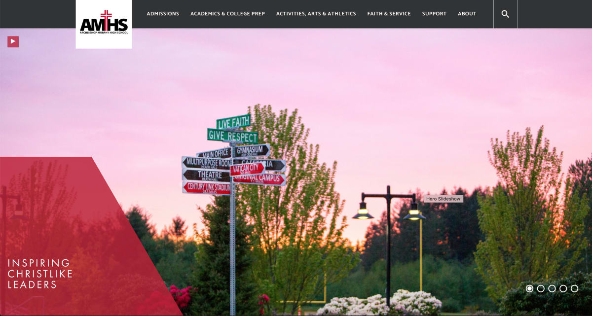


The Westbrook Theme was a perfect match for their school because they had a lot of impressive statistics they wanted to showcase. The staggered statistic grid can be found on other school websites that use the Westbrook Theme (such as Westside School in Seattle, Washington). This stylistic statistics showcase allows visitors to quickly absorb a lot of impressive information.
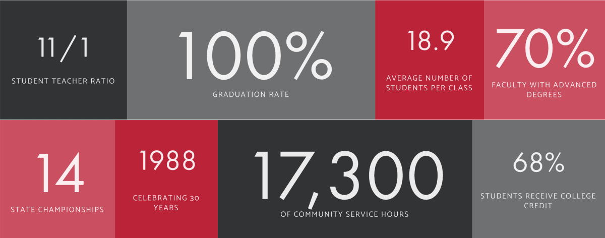


Any prospective student or parent that visits their homepage and scrolls down will see their impressive 100 percent graduation rate, small student to teacher ratio, and small class size average statistics. It’s a quick way to present valuable information to those thinking about applying to your school. And on the website backend, this infographic can be easily edited and updated anytime.
Lastly, if the visitor has scrolled this far down the page, they can scroll just a little bit lower to see a highlight of select AMHS staff and students in a visual format with large pictures that truly engage.


Clicking through opens a pop-up window with a short informational blurb about the individual (this one being Jordan James, Director of Wellness and Sports Performance as AMHS). You can then read a short Q&A-style interview with the individual. It’s an endearing and personal way for visitors new and old to connect with the school without ever having the need to actually visit or attend.
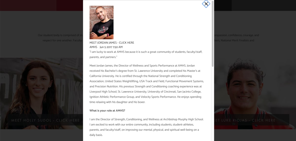


Archbishop Murphy High School did an incredible job of using the Westbrook Theme to pack in a ton of information into a relatively short homepage that presents visitors with everything they need to know in a visually-appealing fashion, all within that important 10-second window.
3. But Don’t Forget About Those Interior Pages!
While the homepage is the single most important page on your website, it’s important to remember that most visitors use the homepage as a launching point to access the other pages spread throughout your website, or even other websites for our school districts.
Creating an awesome homepage means next to nothing if your interior pages are bland and unappealing. It’s like picking up a book with an exciting cover, only to discover the book is dry and boring once you’ve read the first few pages. It’s important to keep visitors engaged throughout their entire journey across your pages.
National Child Research Center, a historic and leading preschool in Washington, D.C., does an excellent job of keeping visitors engaged as they navigate the website through consistent use of amazing photos, interactive elements (such as fillable forms), and unique infographics and charts.
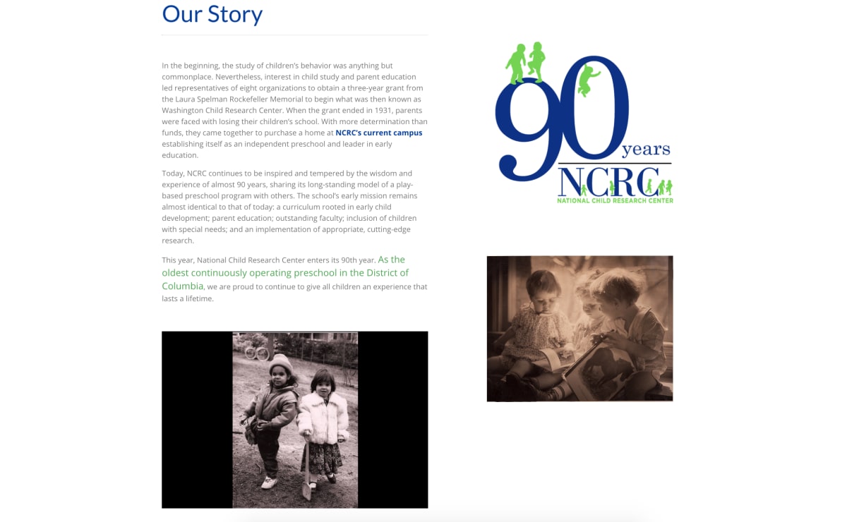


For example, their “Our Story” page incorporates a “90 Years” graphic to celebrate nine decades of service. Just below the graphic rests a historical photograph serving as a visual time capsule, with a Media Element to the left that continuously cycles through an archive of historical photos. It’s an effective way to engage visitors while reminding them that 90-years worth of parents have trusted their children’s education to their preschool. It’s subtle, yet effective.
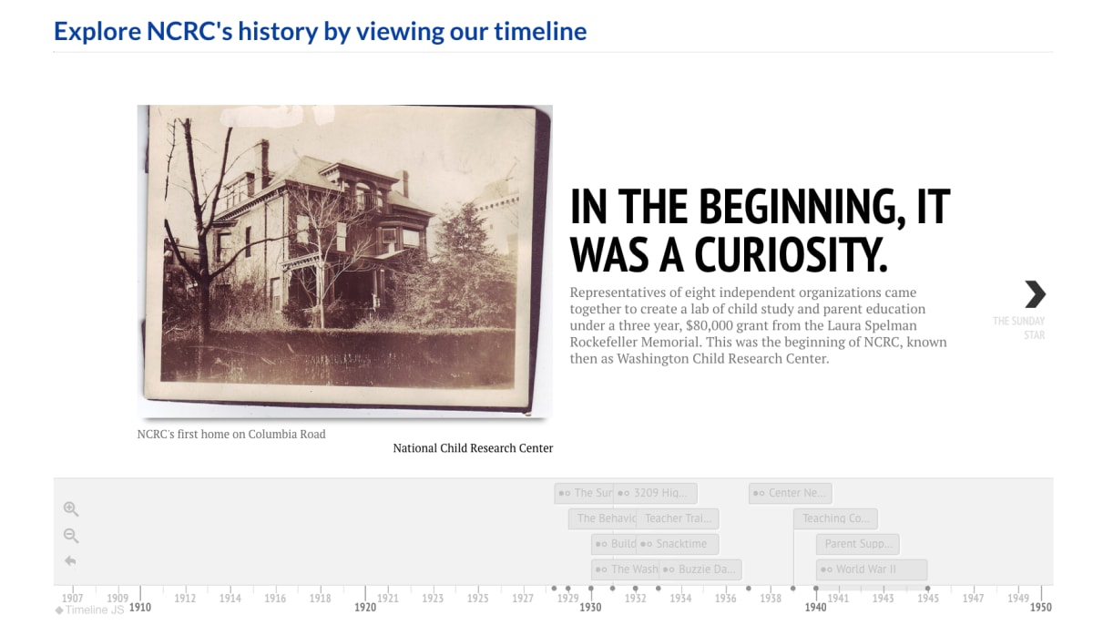


The bottom of the page also incorporates an interactive timeline through an Embed Element so visitors can further extended their stay on the page by viewing an exhaustive look back at the history of the preschool.
4. Enhance Themes With Liberal Use of Photos!
It goes without saying that liberal use of awesome photography goes a long way in engaging every website visitor, regardless of your school’s photography budget.
It all goes back to that famous expression, “A picture is worth a thousand words.” In fact, we find photos to be so integral to creating a best-in-class website that we wrote a blog talking all about website photography earlier this year.
Heritage Christian School enhances their Avon theme with great use of stunning images on their homepage that automatically cycle through the Media element at the top of the page.
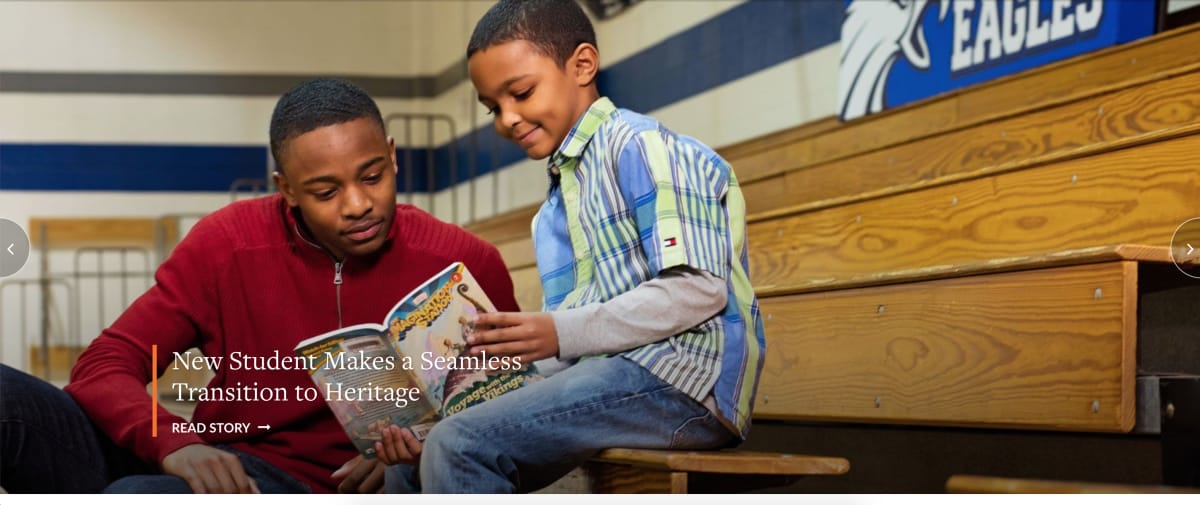


This particular photo leverages empty space well and connects users to an engaging story about a specific student. Going the extra distance to elevate your website with great photos is a simple way to improve the overall quality of a website. Think of it like hiring a professional photographer for your family photos. You can always take the photos yourself, but a professional will produce a better result nearly every time.
But don’t waste all your photography on the homepage, and don’t forget those interior pages. Spreading out your awesome photos throughout all of your interior pages keeps visitors engaged during their entire visit.
Landmark Preschool makes excellent use of photos to keep visitors engaged as they check out pages other than the homepage. In particular, their “About Us” page features an adorable photo of one of their preschoolers.
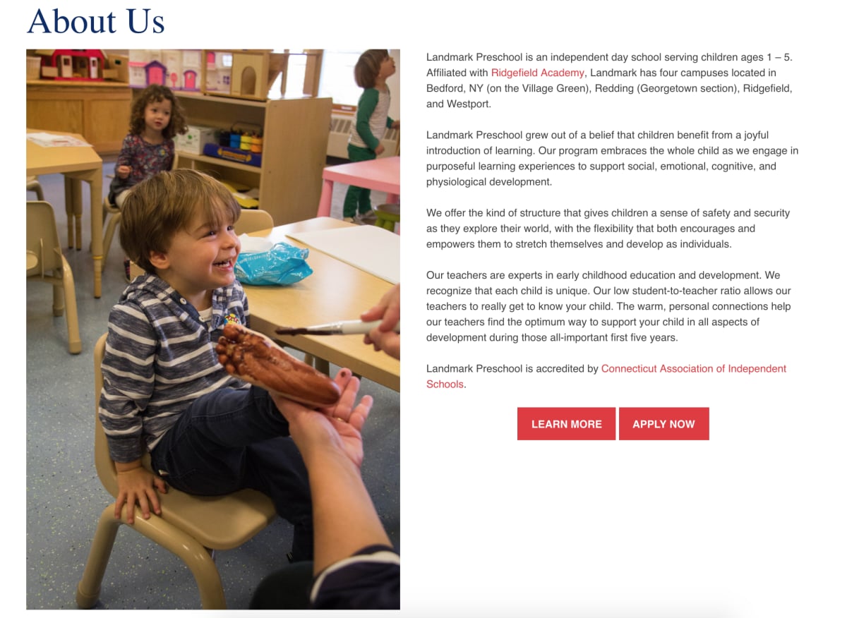


And their “Vacation Clubs” page features an equally compelling photo.


Not only do these photos look great, but they also break up the monotony of viewing page after page of text. While some information can only be conveyed through paragraphs, bear in mind that people are able to process information conveyed through images far more efficiently and quickly, with less work, than text alone.
5. And Keep Image and Thumbnail Sizes Consistent Throughout Your Site!
Our final tip: keeping image and thumbnail sizes consistent throughout your website and posts creates a streamlined look that’s consistent across all devices: desktop, tablet, and mobile. Considering half of a school’s website traffic comes from mobile devices, it’s important to go with a “responsive design” when choosing the look and layout for you website.
Fortunately, all of our theme designs are built from the ground up with mobile devices in mind, including a handy preview option in Composer that shows what each page will look like when viewed on different devices.
Let’s take a look at Westside School, which uses the East Lyme Theme, to show how consistent image and thumbnail sizes across all pages can provide a better, more visually-appealing browsing experience. Think of it like reading a book: you’d expect a consistent font size and style from start to end, right? Suddenly switching size or style, or randomly switching between several or more at a time, creates a confusing, perhaps even frustrating, user experience.
At the time of writing this blog, Westside’s blog has various different sizes for the thumbnails scattered through the page. Most are the same size, but that makes the inconsistencies in size all the more noticeable. See how off this row looks when all three thumbnail images are a different size?
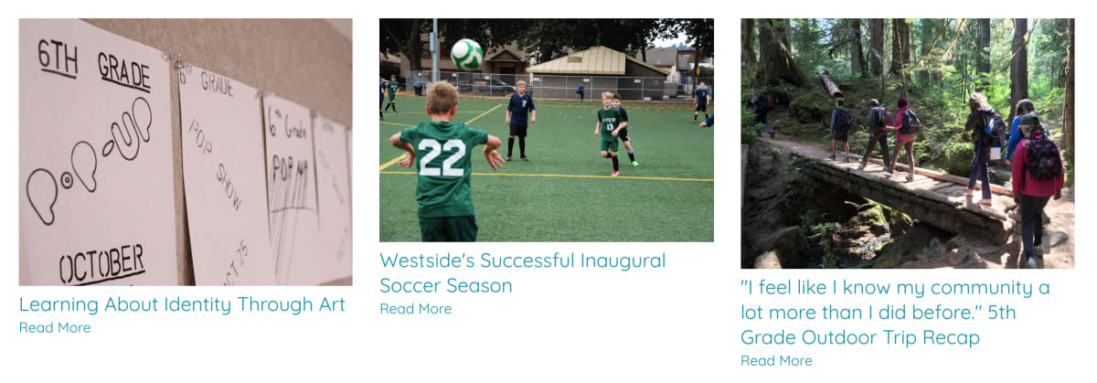


Let’s see if we can fix that.
To do so, let’s head into Composer, click on the grey gear icon at the top of the Posts element, and head down to the “Formatting” section. From there, we’ll select the “Shape” option under the “Page Thumbnail” section. This is where you can adjust the size and shape of each thumbnail on the page.
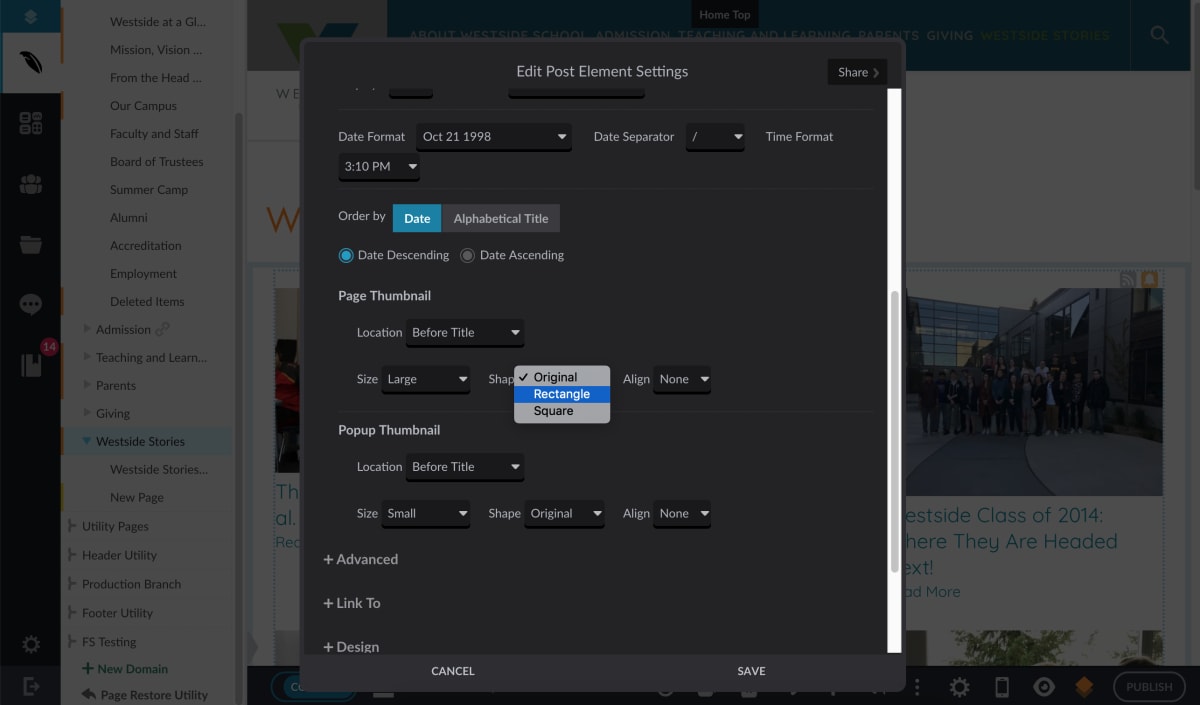


The “Size” choice of “Large” is fine as is, but let’s change that “Shape” option from “Original” to “Rectangle”. Now, let’s take a look at the changes.


Much better, right? Now, all three thumbnails in the row are the exact same height and length, creating a visual consistency that makes it easier to look not only across this one row, but up and down the other rows on the page, too. Maintaining a consistent image and thumbnail size on every page across your website makes browsing your website just a bit easier.
We also recommend uploading images and videos to Resources, which allows you to import the same image or video to multiple pages, rather than needing to upload the same content over and over again. Resources also automatically optimizes each image and video to load in varying sizes or qualities based on the device the visitor uses, as well as their internet speed.
Read the original post here:
https://www.finalsite.com/blog/p/~board/b/post/tips-to-get-most-out-of-theme-designs
