Should you organize your independent school website by department or by audience? Here’s my navigation formula for making your website simple for your visitors to use.
When you and I go to a website, we’ve only got one thing in mind: Find the answers to our questions.
It could be a product website where we are researching something we need to buy. It could be a church’s website where we’re looking for information on the next volunteering opportunity. It could be our local news site.
Some websites make it extremely easy to find the answers we need. Others make it incredibly difficult.
Easy website navigation can increase visitor loyalty to your education brand.
Why? Because visitors remember the great experience they had on your site!
You’re more likely to revisit a site that made things simple for you than to go back to a site where you couldn’t find simple answers to your questions.
So why isn’t it easy to simplify the navigation on your independent school website?
Because complexity is an inherent component of education. Your school district has lots of departments, teams, grade-levels, programs, events, community stakeholders, and objectives.
No matter what you do, you can’t make a school district less complicated than that. So making things easy-to-find for visitors from all of your marketing audiences is a big challenge.
To meet this challenge, there are basically two schools of thought on how to organize your independent school website.
Let’s talk about them, and then I’ll share with you my tried-and-true navigation formula for independent school websites.
Navigation by Department
This school of thought says that the navigation bar should feature the various departments of your school district.
With this way of thinking, you might see elements like “About Us,” “School News,” “School Board,” or “Academics.”
This strategy has a lot going for it.
It just makes sense that the user would select the department most likely to have the answer to their question. Also, if an internal user—like a student or faculty member—needs access to an internal resource, they’d simply choose the department responsible.
But this strategy has drawbacks.
Not Knowing Where to Go
What if the user doesn’t know which department is responsible for having the answer to their question? This happens more often than we’d like to think.
When you’re an insider, you just know where to go for answers. But your audience doesn’t always know what you know.
How would a visitor know who’s responsible for what? Where does the user go then?
Too Many Departments
If your school district is as complex as some of our clients’ educational organizations, listing every department can be nearly impossible to do.
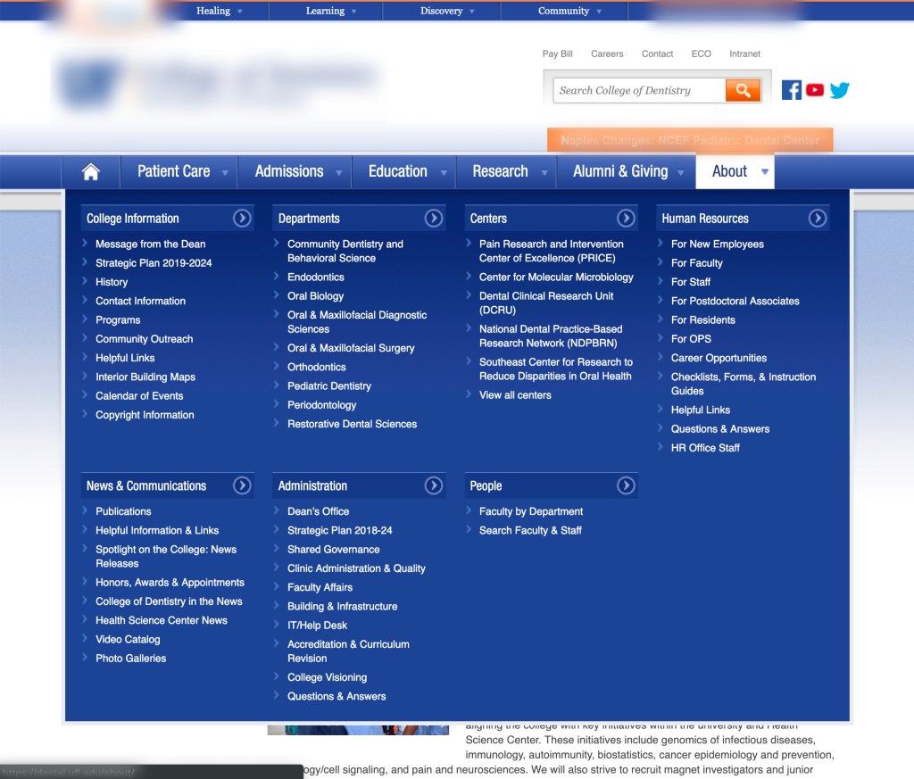
This is where you’ll likely run into mega-menus that look a lot like department directories.


Here I’m using a university example, but if your independent school website looks like this, it may be time to reevaluate how you’re organizing your website navigation.
Navigation by Audience
The other school of thought says navigation should be organized by your marketing audience. The navigation bar might contain words like “Student,” “Parent,” or “Alumni.”
The idea is that it should be natural for a user to self-identify their marketing audience and start there. A visitor’s internal dialogue would sound like: “I’m a parent, so I’ll click here.”
The strength of this strategy is that it’s more intuitive for me to know which social group I belong to than to guess which department of your school would have the answers I’m looking for.
But problems arise when the user is supposed to self-identify.
- Group labels aren’t always clear. For example, the term “student” could mean prospective student, current student, returning student, or a transfer student.
- There are too many audiences to fit into the navigation. More than likely, your school has too many marketing audiences to place easily into the navigation bar.
- Users are often members of multiple audiences. They could be an alumnus, a donor, and a parent. Which link should they click on in your navigation bar?
Communicate Health is a web design agency for the health industry, but what they had to say about audience-based navigation applies for education marketing, too.
At the end of the day, audience-based navigation just doesn’t represent how people think. Users typically come to [your] websites to complete a specific task or learn about a… topic, and that’s what’s on their minds — not which audience they belong to.
For these reasons, audience-based navigation should usually be avoided if possible.
So what is the answer? How should you organize your independent school website navigation?
My Website Navigation Formula for independent school Websites
After many years of designing education websites, I’ve come up with a navigation formula that works extremely well.
5a + 2c + x = Primary Navigation
Your website has to contain the basics. For most traditional schools, that includes the five “A’s”:
- Admissions
- About Us
- Academics
- Athletics
- Advancement
These will make up the core of your content. Each area should show your distinctives and benefits and provide clear call-to-action on every page.
After the five “A’s” you’ll add the two “C’s”:
- Community
- Contact
The Community section will allow a student to understand what life on campus will be like. The Contact Us navigation will provide direct access to immediate contact information such as phone numbers, email addresses, address, map links, directions, and other relevant information such as hours.
The next part of the formula is the variable. Based upon your brand, distinctives, and other features, you may consider picking one of the following:
- Blog/News
- Faith
- Summer Programs
- Etc.
While you might not use these exact words, just know that the variable will form the alliteration for you to remember what is important. For example, if your variable is “Blog,” then the formula will look like this:
5a + 2c + B = Primary Navigation
You’ll also note that the formula is based upon eight primary navigation buttons. You should target somewhere between seven and nine for the primary navigation.
Making the Complex Simple
At its core, I think education is about making complex ideas easier for your audiences to understand. You can’t make everything simple, but you can make it easier for a user to grasp the concept.
This is what your education website should seek to achieve…
Making something as complex as navigating a independent school website simple and intuitive.
Click here to read this article on the Caylor Solutions website.


